This post is part of a series where we will be using the Log Analytics workspace to store Office 365 information which will then be used to create a dashboard. We will first create the Log Analytics workspace in Azure, then create an app registration in Azure Active Directory, then a Runbook using Automation Accounts to upload data to the Log Analytics workspace and lastly we will be building a dashboard in the Log Analytics workspace.
The following posts are part of these series:
- Creating a Log Analytics workspace in Azure
- Registering an app in Azure Active Directory
- Creating a PowerShell Runbook using Automation Accounts
- Building an Azure dashboard
- Building a Log Analytics workspace dashboard
Azure dashboard
You can create multiple dashboards in the Azure portal that each include tiles visualizing data from multiple Azure resources across different resource groups and subscriptions. You can pin different charts and views from Azure Application Insights to create custom dashboards that provide you with complete picture of the health and performance of your application.
Building a new Azure dashboard
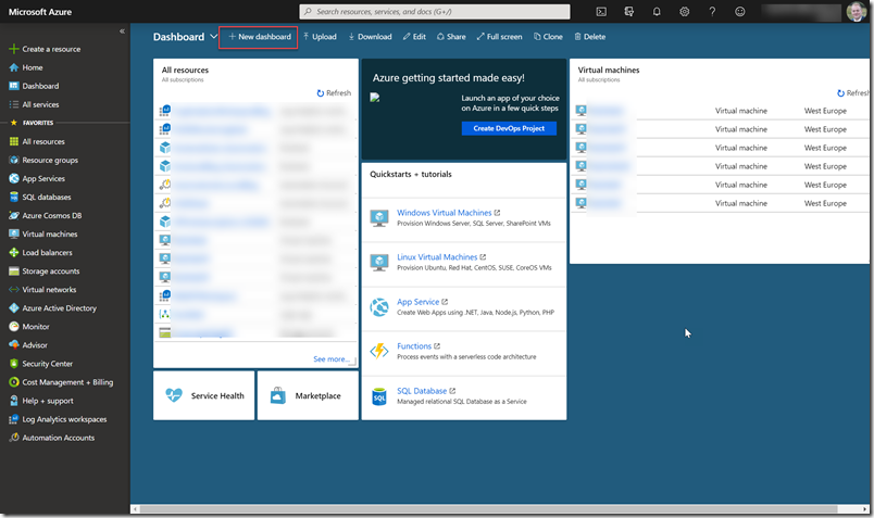
First go to Azure dashboards
Click on ‘New dashboard’
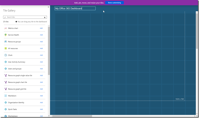
Give it a name and select done customizing
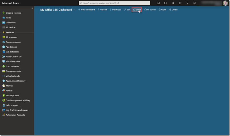
Click on ‘Share’
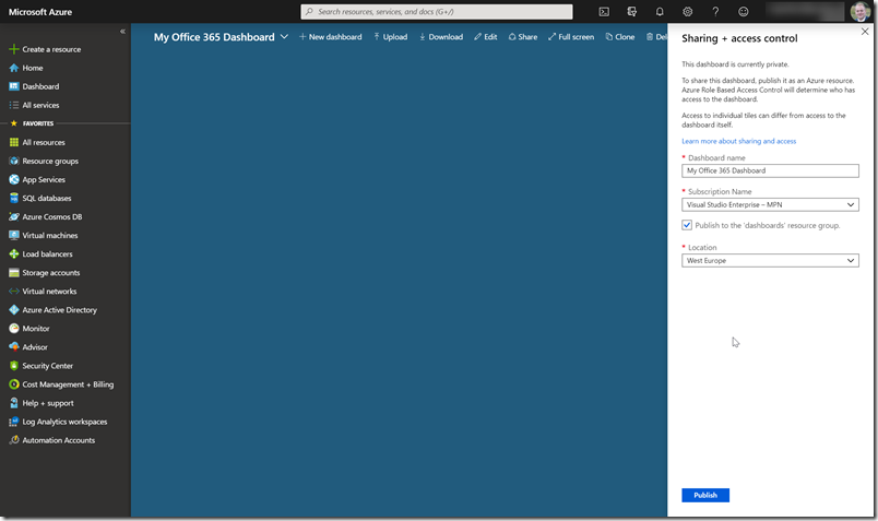
Enter the required properties and click on ‘Publish’
Building your first dashboard part
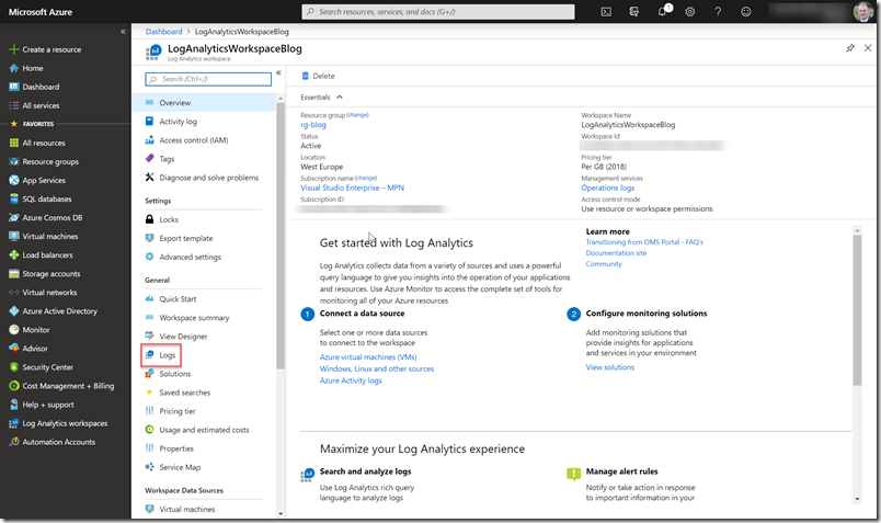
Go to the Log Analytics workspace
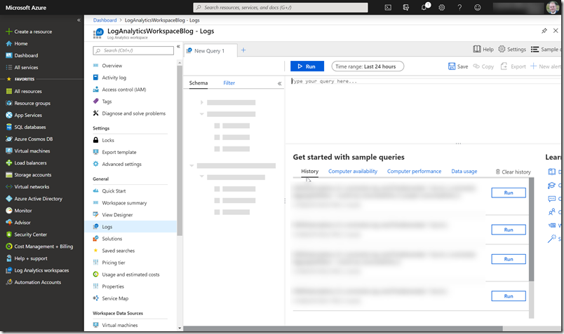
Go to ‘Logs’
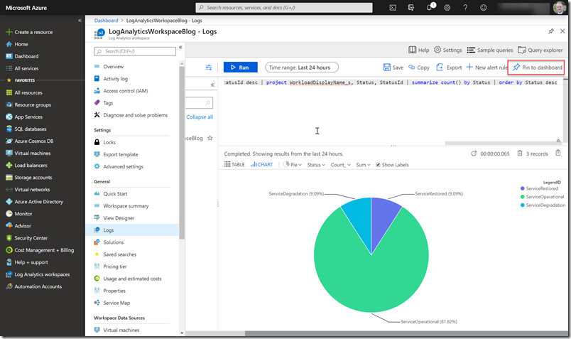
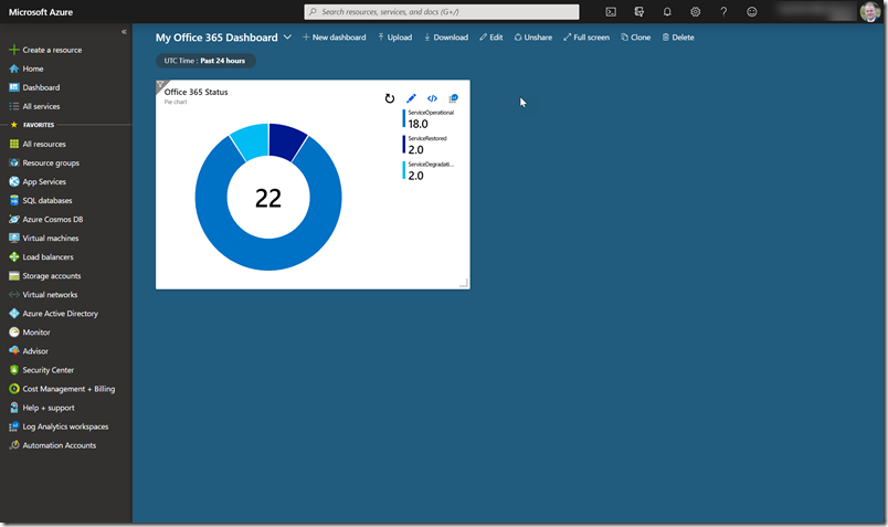
We first going to visualize the Office 365 tenant status in a pie chart so run the following query
O365Status_CL | summarize arg_max(TimeGenerated, *) by Id_s | project-rename Service = Id_s, Status = Status_s | extend StatusId = case(Status == “ServiceOperational”, 0, Status == “ServiceDegradation”, 2, 1) | order by StatusId desc | project WorkloadDisplayName_s, Status, StatusId | summarize count() by Status | order by Status desc
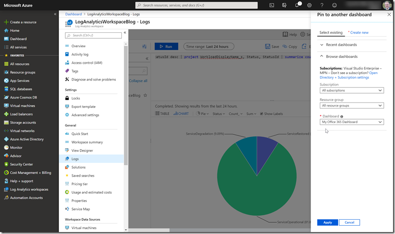
Verify the results and click on ‘Pin to dashboard’
Apply it to the newly created dashboard
Building your second dashboard part
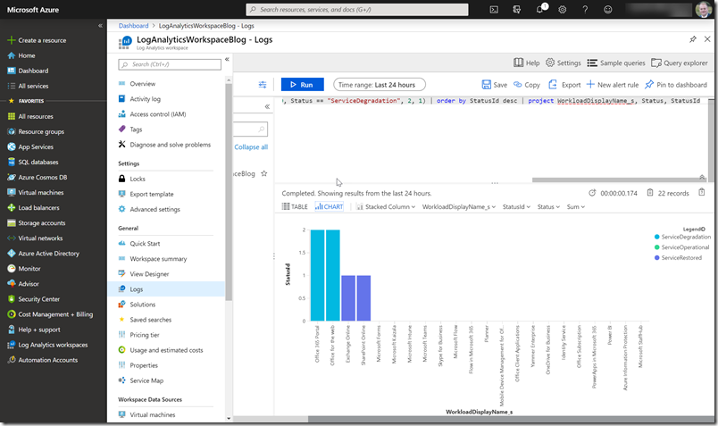
Go back to the Log Analytics workspace and then use the following query to stacked column chart
O365Status_CL | summarize arg_max(TimeGenerated, *) by Id_s | project-rename Service = Id_s, Status = Status_s | extend StatusId = case(Status == “ServiceOperational”, 0, Status == “ServiceDegradation”, 2, 1) | order by StatusId desc | project WorkloadDisplayName_s, Status, StatusId
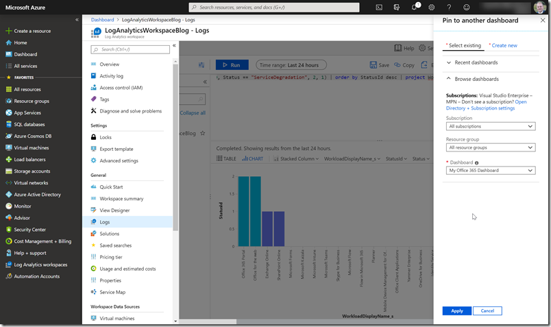
We are going to pin this query to the dashboard again.
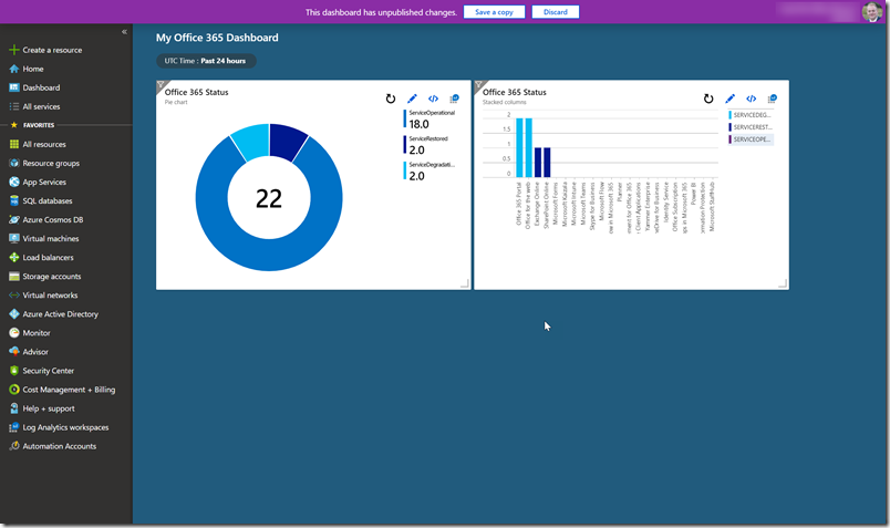
Click on apply and open the dashboard
Building your third dashboard part
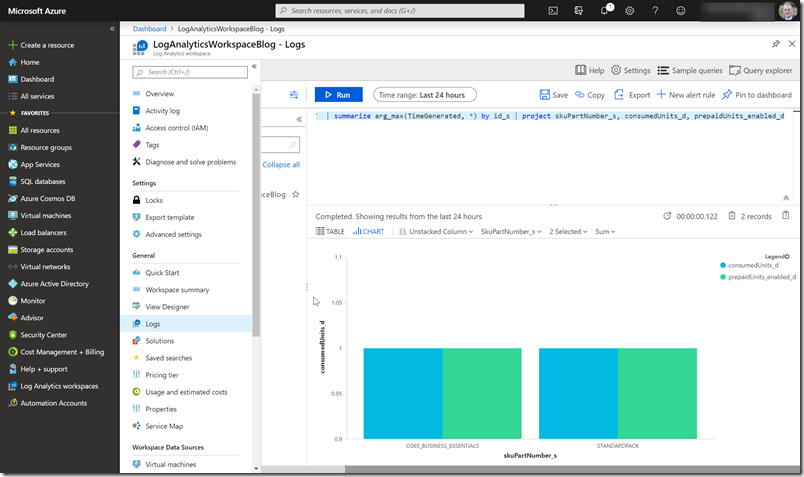
Go back to the Log Analytics workspace and then use the following query to unstacked column chart
O365Subscriptions_CL | where skuPartNumber_s != “FLOW_FREE” | where capabilityStatus_s != “Suspended” | summarize arg_max(TimeGenerated, *) by id_s | project skuPartNumber_s, consumedUnits_d, prepaidUnits_enabled_d
Note: I’ve edited the query to show only my active licenses on this tenant and I can now see that I don’t have any license available.
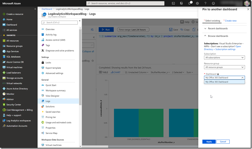
We are going to pin this query to the dashboard again.
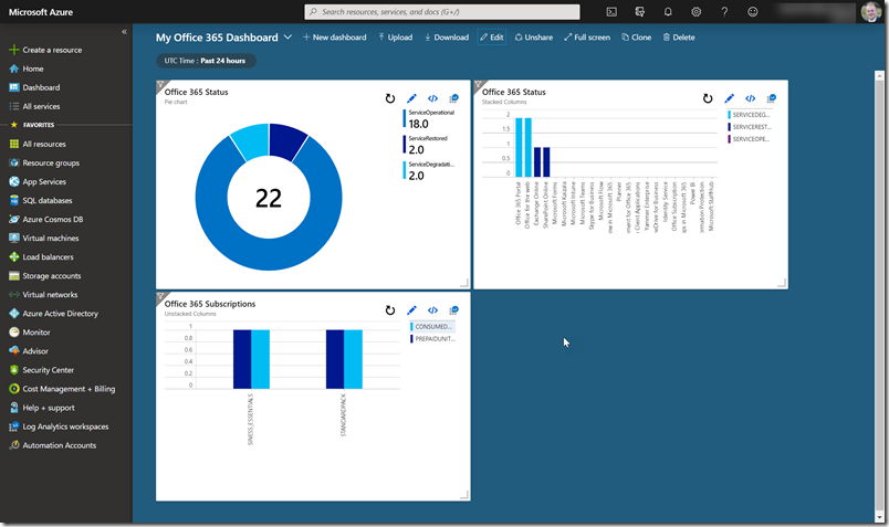
Apply and open the dashboard
