This post is part of a series where we will be using the Log Analytics workspace to store Office 365 information which will then be used to create a dashboard. We will first create the Log Analytics workspace in Azure, then create an app registration in Azure Active Directory, then a Runbook using Automation Accounts to upload data to the Log Analytics workspace and lastly we will be building a dashboard in the Log Analytics workspace.
The following posts are part of these series:
- Creating a Log Analytics workspace in Azure
- Registering an app in Azure Active Directory
- Creating a PowerShell Runbook using Automation Accounts
- Building an Azure dashboard
- Building a Log Analytics workspace dashboard
Log Analytics dashboard designer
Log Analytics dashboards can visualize all of your saved log queries, giving you the ability to find, correlate, and share IT operational data in the organization. This tutorial covers creating a log query that will be used to support a shared dashboard that will be accessed by your IT operations support team. You learn how to:
- Create a shared dashboard in the Azure portal
- Visualize a performance log query
- Add a log query to a shared dashboard
- Customize a tile in a shared dashboard
Building your first dashboard part
Go to the Log Analytics workspace
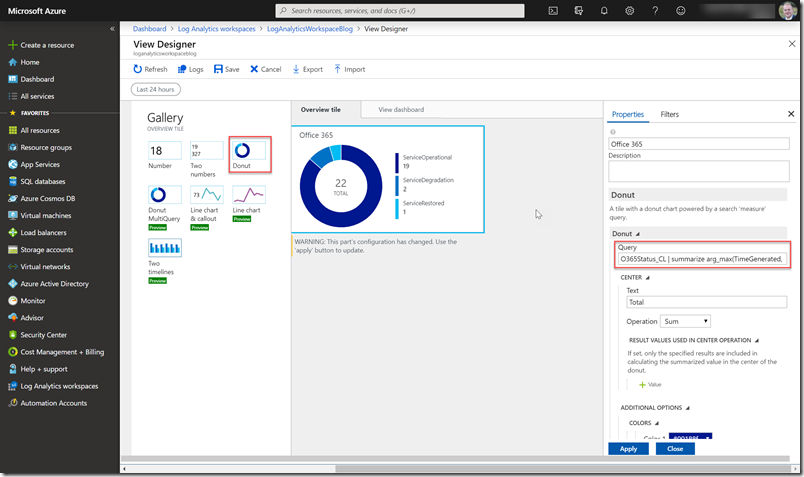
Go to ‘View Designer’
Select Donut and fill in the following query
O365Status_CL | summarize arg_max(TimeGenerated, *) by Id_s | project-rename Service = Id_s, Status = Status_s | extend StatusId = case(Status == “ServiceOperational”, 0, Status == “ServiceDegradation”, 2, 1) | order by StatusId desc | project WorkloadDisplayName_s, Status, StatusId | summarize count() by Status | order by Status desc
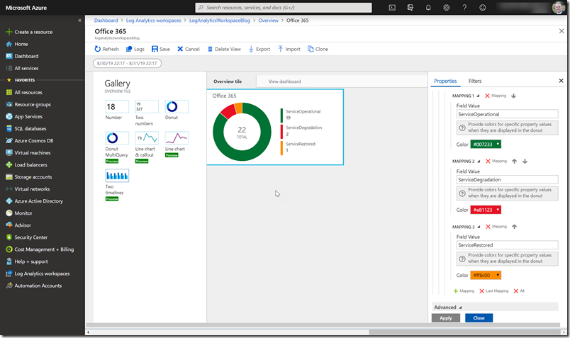
Scroll down to change the colours
Then change to ‘View dashboard’
We first going to visualize the Office 365 tenant status so we are going to use the Donut & Tile.
We are going to use the following Donut query to visualize the amount of the last data upload.
O365Status_CL | summarize arg_max(TimeGenerated, *) by Id_s | project-rename Service = Id_s, Status = Status_s | extend StatusId = case(Status == “ServiceOperational”, 0, Status == “ServiceDegradation”, 2, 1) | order by StatusId desc | project WorkloadDisplayName_s, Status, StatusId | summarize count() by Status | order by Status desc
Scroll down so we can select our colors
Scroll down to fill our list where we going to use the following query.
O365Status_CL | summarize arg_max(TimeGenerated, *) by Id_s | project-rename Service = Id_s, Status = Status_s | extend StatusId = case(Status == “ServiceOperational”, 0, Status == “ServiceDegradation”, 2, 1) | order by StatusId desc | project WorkloadDisplayName_s, Status, StatusId
Building your second dashboard part
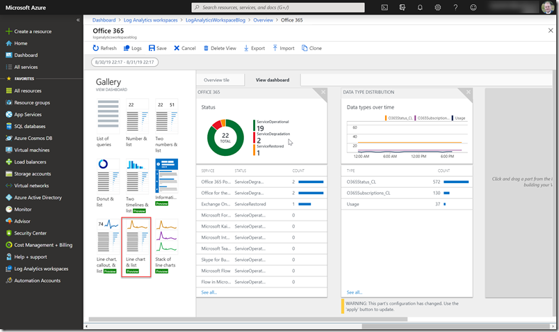
We are going to use the Line chart
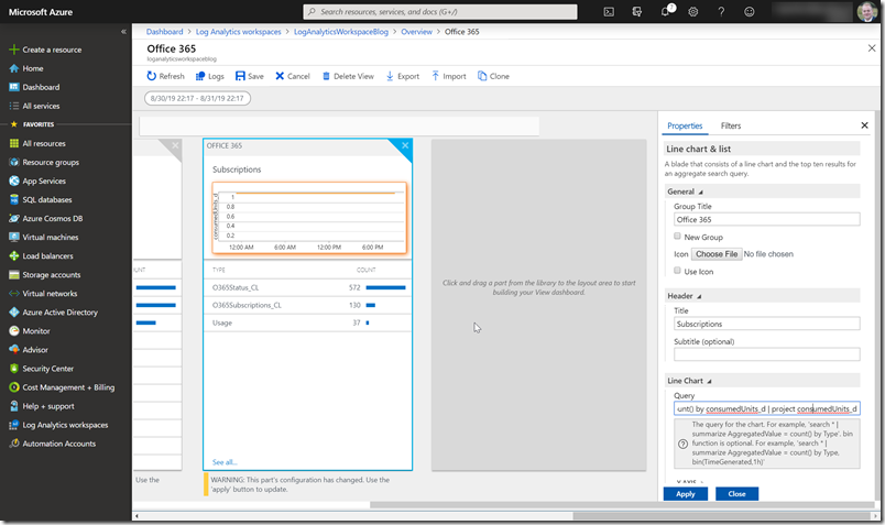
Start editing this dashboard part.
We are going to use the following line chart query to visualize the amount of the last data upload.
O365Subscriptions_CL | where skuPartNumber_s == “STANDARDPACK” | project consumedUnits_d , TimeGenerated | order by TimeGenerated desc
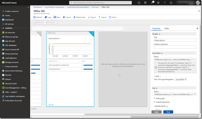
Scroll down to fill our list where we going to use the following query.
O365Subscriptions_CL | where skuPartNumber_s != “FLOW_FREE” | where capabilityStatus_s != “Suspended” | summarize arg_max(TimeGenerated, *) by id_s | project skuPartNumber_s, consumedUnits_d
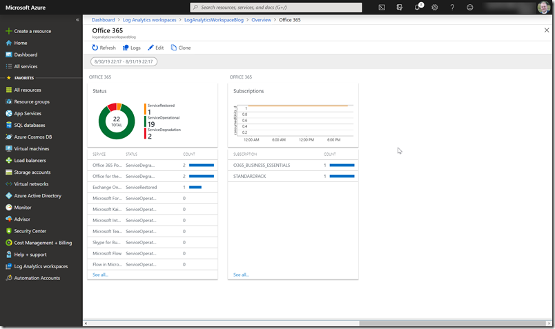
You can now continue editing the dashboard
![image_thumb[3] image_thumb[3]](https://www.cloudsecuritea.com/wp-content/uploads/2019/09/image_thumb3_thumb.png)
![image_thumb[1] image_thumb[1]](https://www.cloudsecuritea.com/wp-content/uploads/2019/09/image_thumb1_thumb.png)
![image_thumb[5] image_thumb[5]](https://www.cloudsecuritea.com/wp-content/uploads/2019/09/image_thumb5_thumb.png)
![image_thumb[8] image_thumb[8]](https://www.cloudsecuritea.com/wp-content/uploads/2019/09/image_thumb8_thumb.png)
![image_thumb[10] image_thumb[10]](https://www.cloudsecuritea.com/wp-content/uploads/2019/09/image_thumb10_thumb.png)
![image_thumb[12] image_thumb[12]](https://www.cloudsecuritea.com/wp-content/uploads/2019/09/image_thumb12_thumb.png)
